
Brand Development, Business System
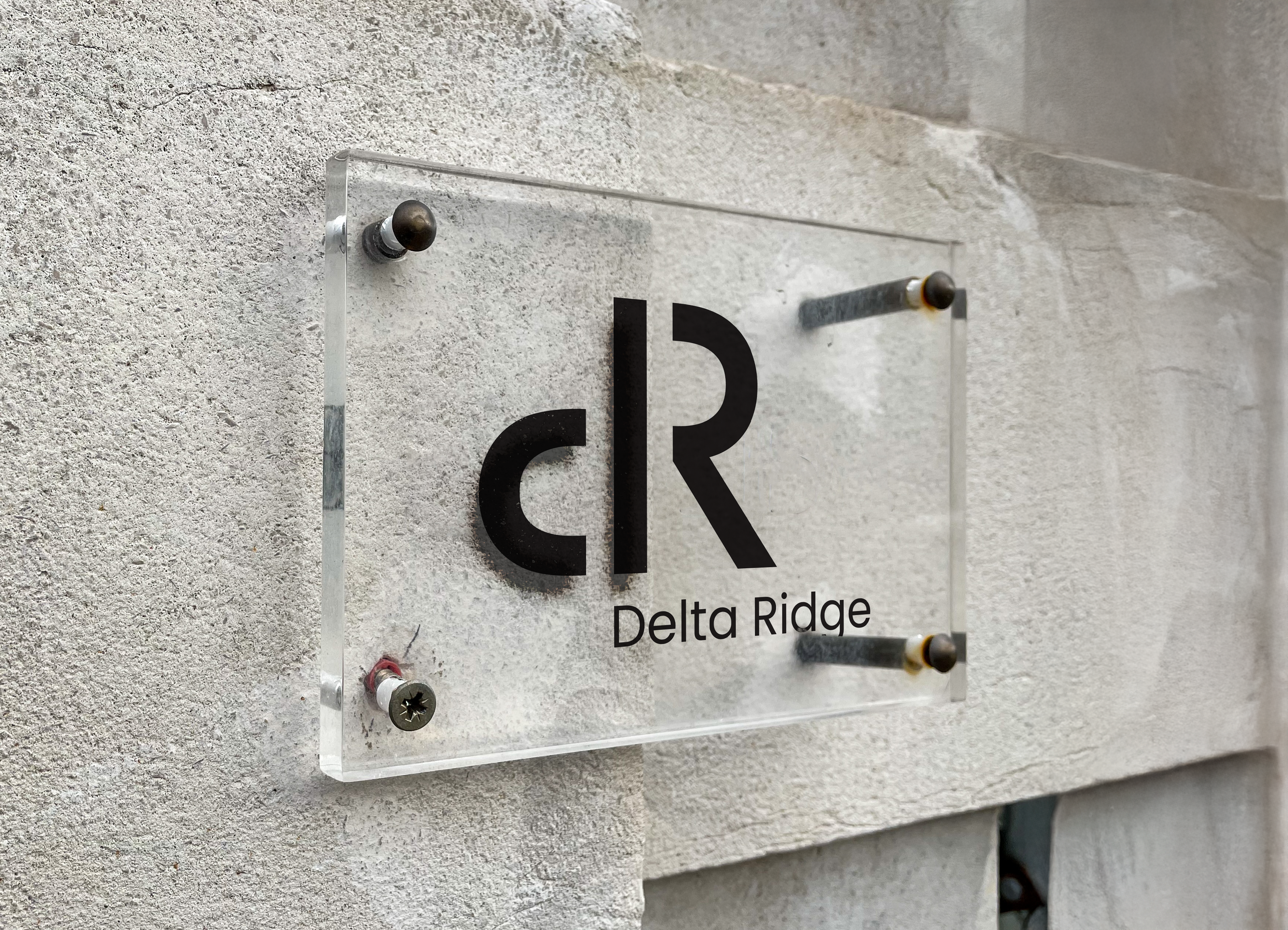
Delta Ridge
The Brand
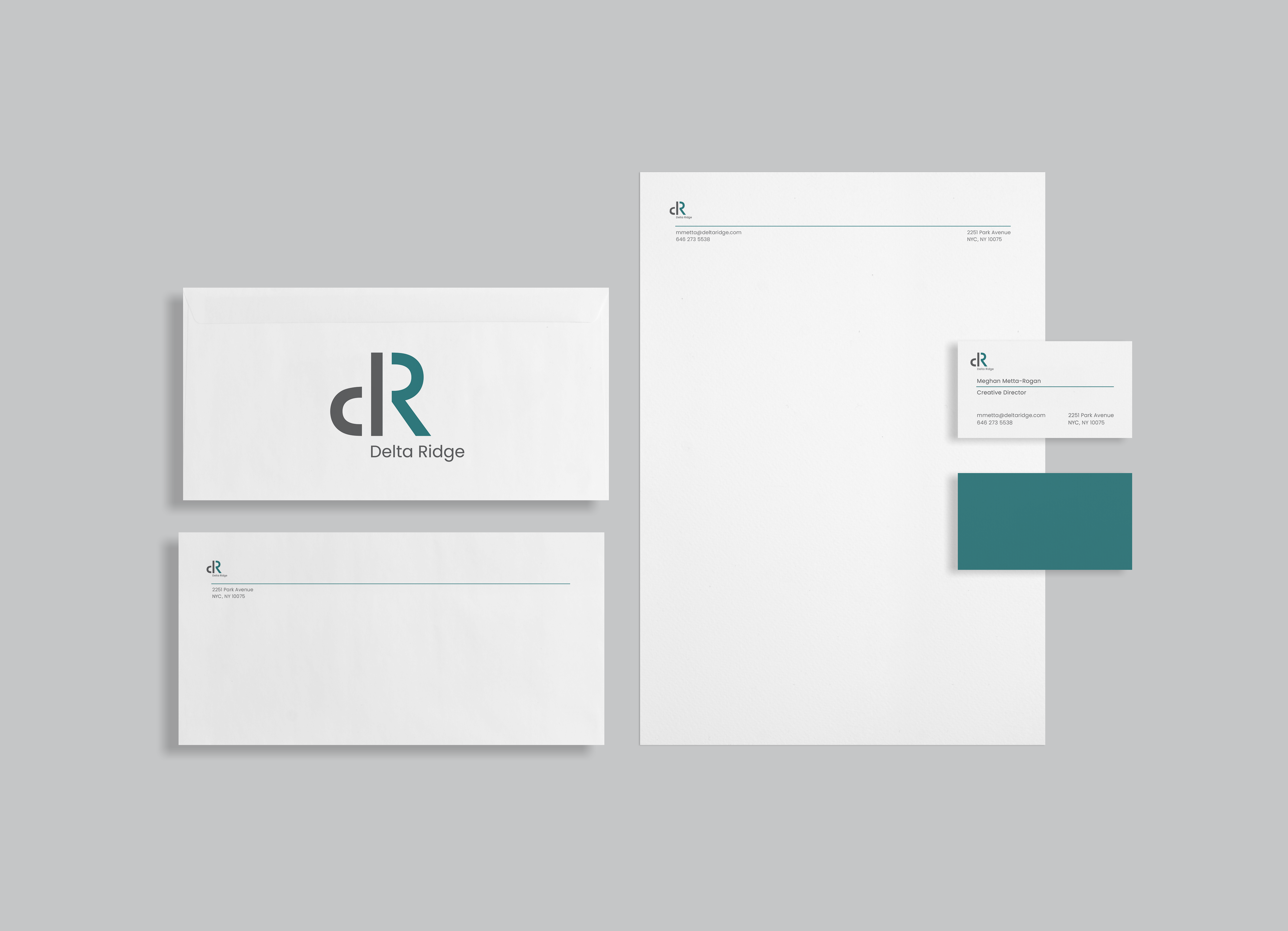
Delta Ridge is a consulting firm focused on clear strategies, creative thinking, and a human-first approach. The brand's colors are unique enough to stand out from the pack of other firms, yet share the same feeling of security and trust.
This study explored using letters and numbers to create a symbol. After creating my symbol, I researched different industries to see which field it best aligned with. I then made decisions about brand colors, identity, and collateral that matched my chosen industry the best.
Timeline
Jan 2024 - Mar 2024
Tools
Adobe Illustrator, Adobe InDesign, Adobe Photoshop
Project Objectives
Design an innovative typographic symbol that seamlessly integrates two existing letter or number forms, creating a unique and recognizable brand mark.
Craft a fictitious company name and align the visual identity with industry norms, ensuring the symbol reflects both aesthetic and functional branding principles.
Present the identity through a polished brand guidelines deck, including logo usage, typography, and color systems.
Exploration of Letterforms
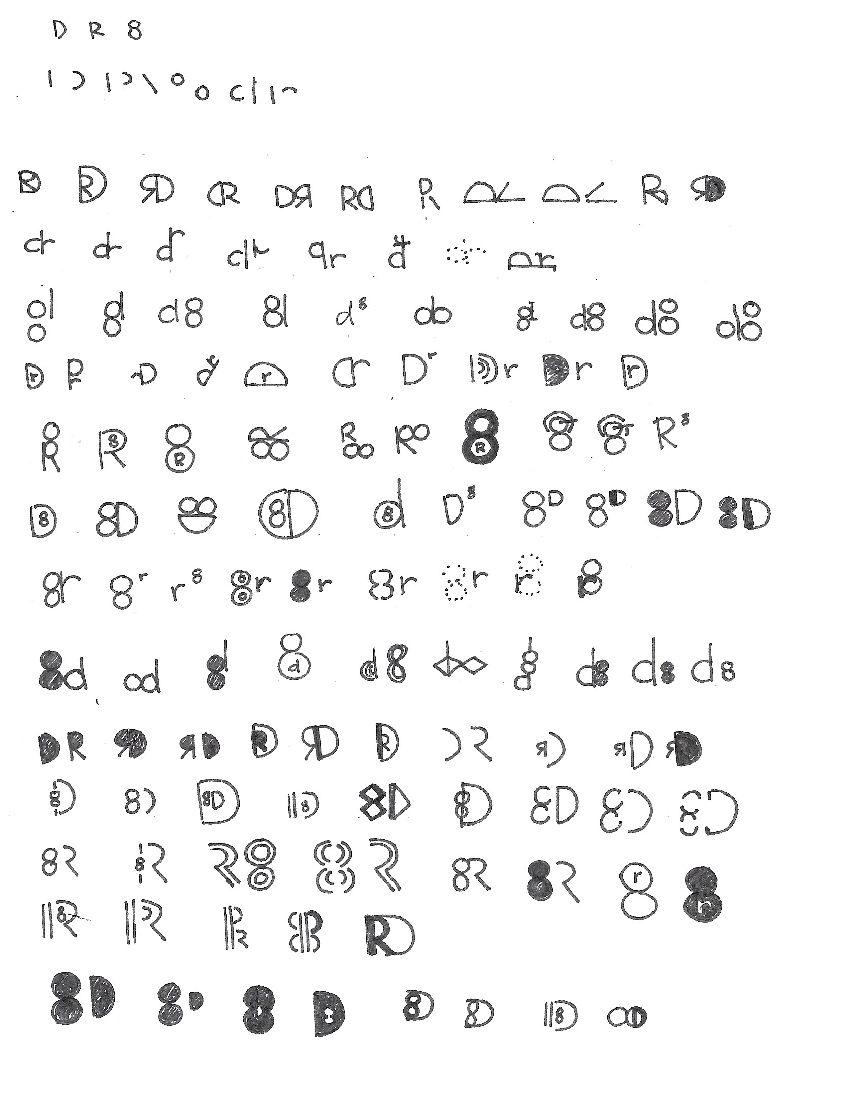
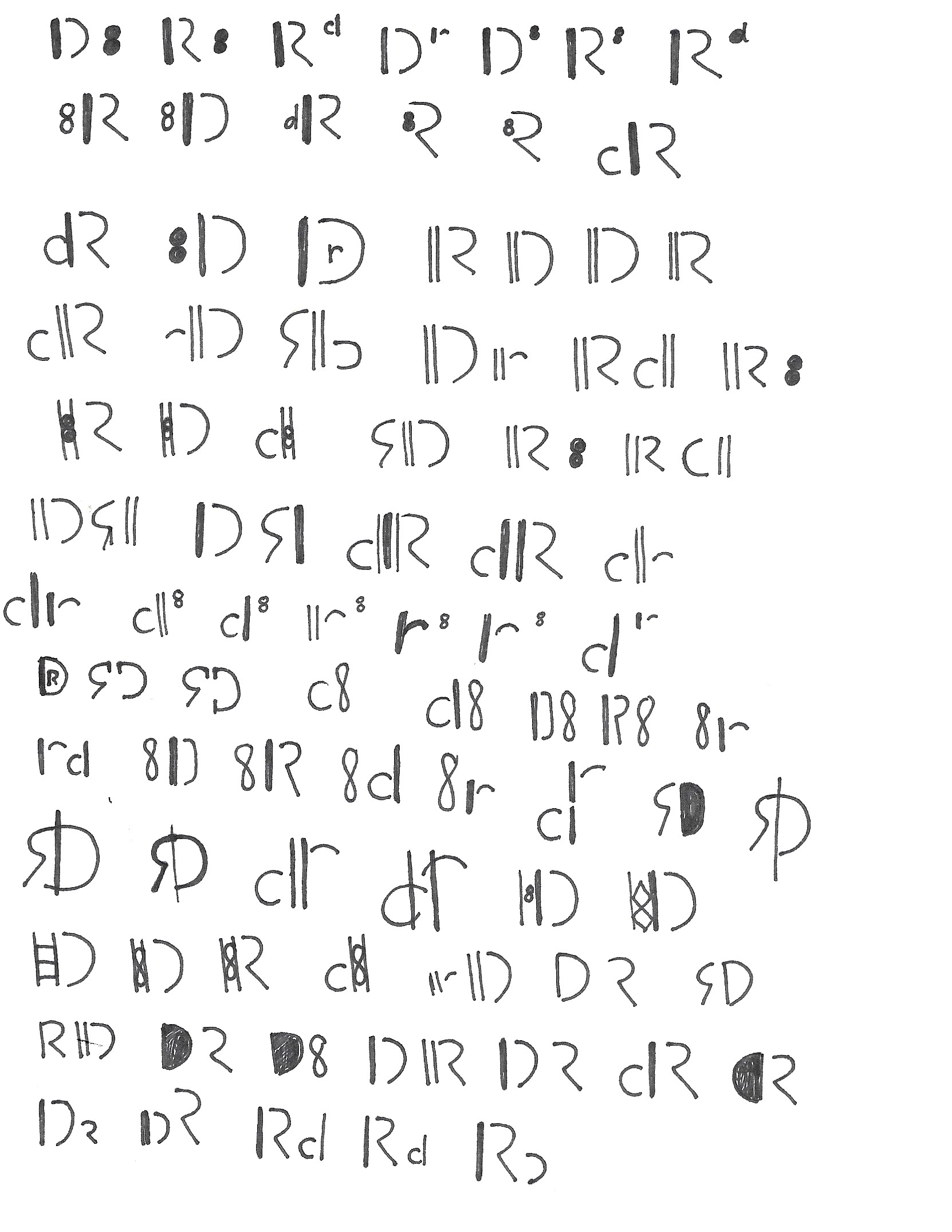
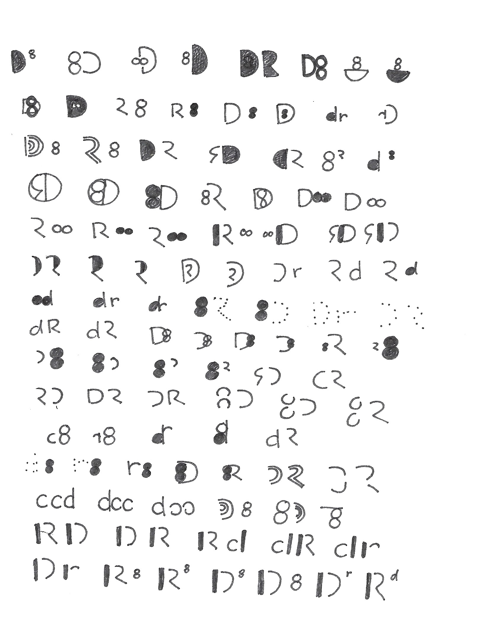
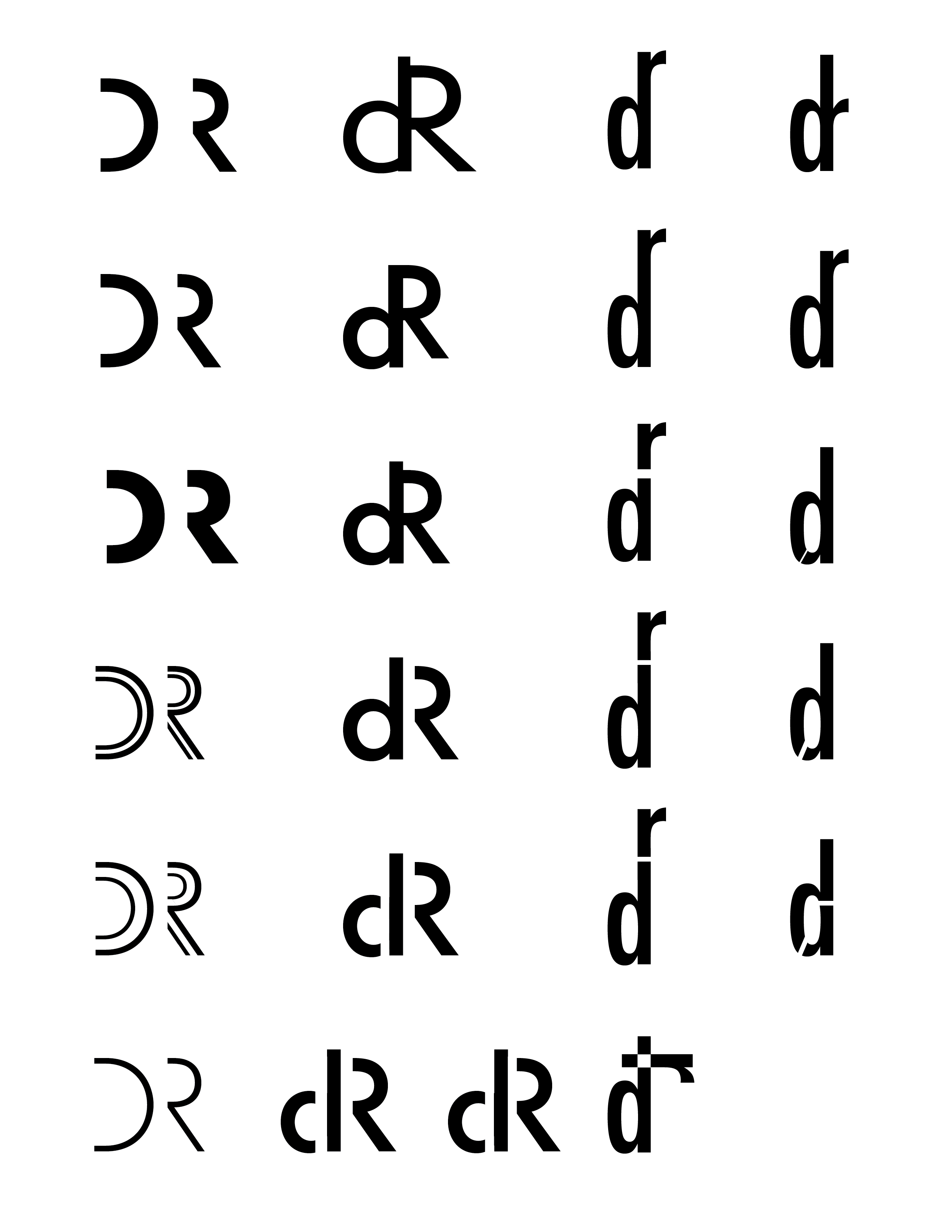
After receiving my randomly assigned letters, ‘D,’ ‘R,’ and ‘8’, I began exploring the components that make up each figure, breaking them down into parts to identify similar or visually interesting forms. I then sketched a series of thumbnails to test combinations, placements, and weights.
Project Details
I completed this project during my Junior year studying graphic design.
Brand Research & Identity
Meghan Metta
Creative Oversight
Kathryn Hawkins
© meghanmetta 2025