
Brand Design & Development
GlobalMed Brand System & Guidelines
GlobalMed
GlobalMed builds telehealth software and medical cart hardware for federal agencies, the Department of Defense, tribal health programs, universities, hospitals, and international government health systems. The company operates in high-stakes, regulated healthcare environments where visual clarity, consistency, and trust are essential.
As the sole designer, I led the design and implementation of the company’s first comprehensive brand system; defining visual language, color, typography, iconography, templates, and production workflows to unify sales, marketing, and government-facing communications across global healthcare markets.
Timeline
June 2025 - Dec 2025
Tools
Adobe Illustrator, Adobe Photoshop, Adobe InDesign, Adobe After Effects
Project Objectives
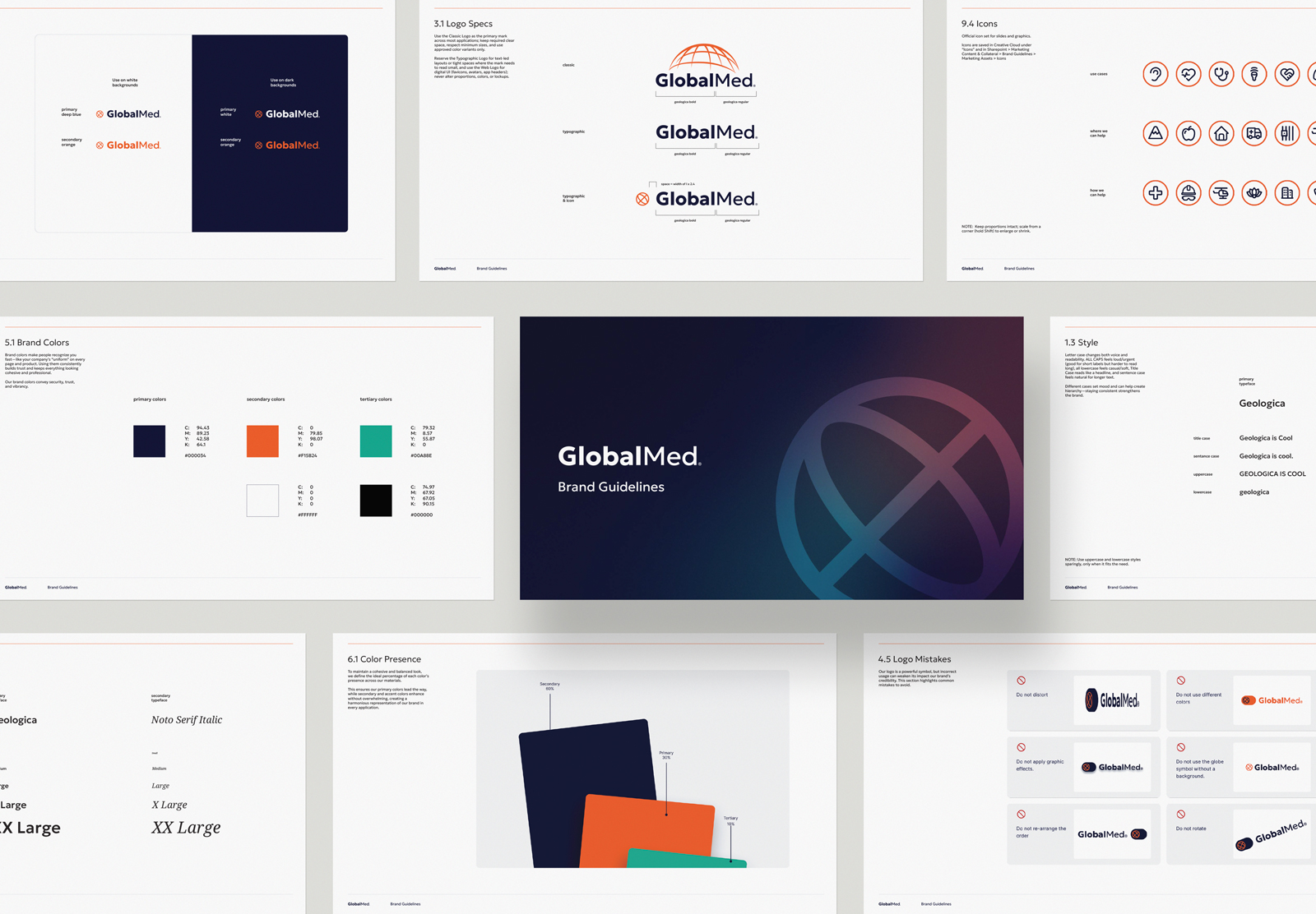
Define GlobalMed's first official brand standards, documenting logo usage, color, gradients, textures, and iconography so the rules hold across print, digital, and video.
Build templates and shared files that let sales, hardware, and leadership pull approved materials themselves instead of routing every request through one designer.
Design a system that flexes between federal procurement and commercial marketing without the brand reading like two different companies.
Research
GlobalMed spent 19 of its first 23 years focused on government contracts, where the work moves through proposals and procurement rather than brand campaigns. The marketing team had also gone from three people to one over that stretch. Each designer who came through built a small identity of their own, which made sense at the time, but it meant there was no single documented answer to what the brand looked like.
I started by auditing what existed and where it lived. Sales decks, product sheets, capability sheets, and tradeshow booth graphics were pulling from a few different shades of the same colors, and the logo used a typeface that appeared nowhere else in the system. Consistency does real work in this sector. When a federal health agency is evaluating diagnostic equipment, every document is part of how they judge whether the company is precise, so tightening that became the first priority.
Initial Ideation
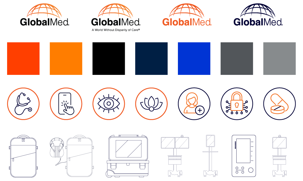
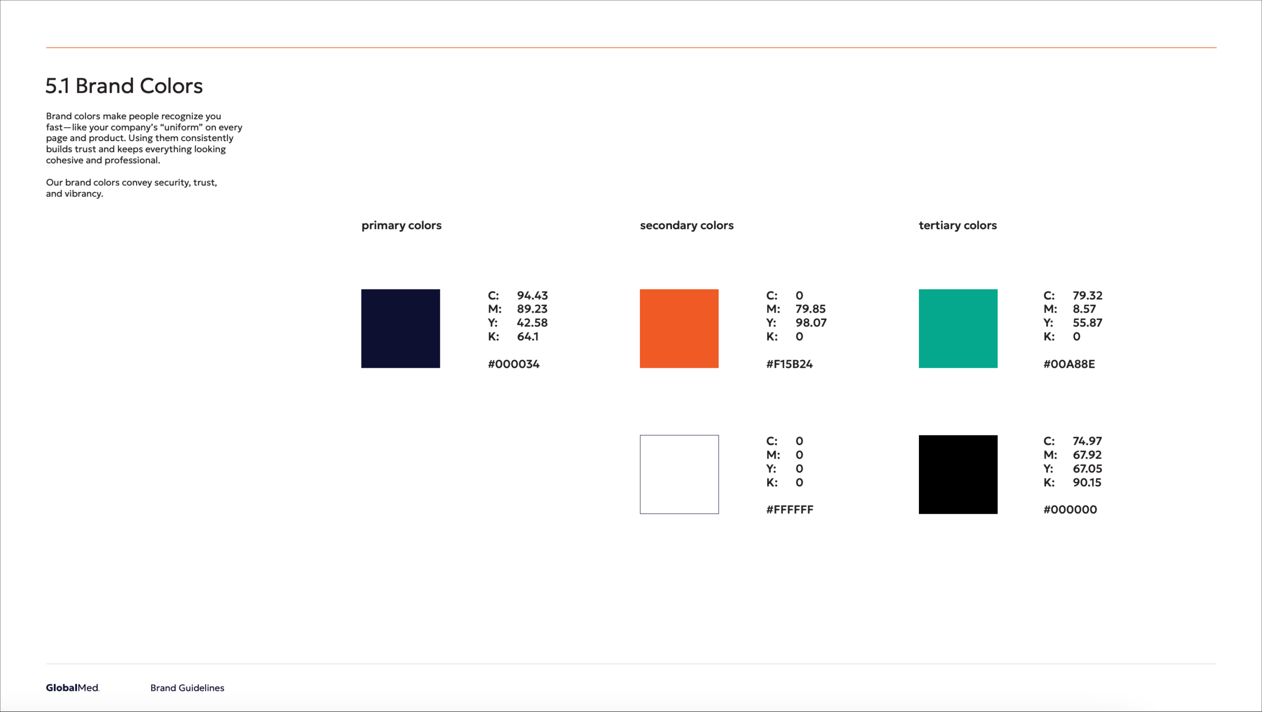
I built the palette around what the sales conversation needed to communicate before anyone said a word. Deep blue carries the reliability side, orange carries the warmth and wellbeing side, and I documented which was primary, which was secondary, and which was tertiary so nobody had to guess again. Gradients came out of those colors as a way to add interest without adding noise.
I also drew a map texture into the system, since GlobalMed operates internationally, and standardized an icon set covering medical specialties like dermatology, dental, and pulmonology, plus deployment settings like clinics, mobile medicine, and remote locations. The ATO, HIPAA, ISO, and SOC 2 credential lockups got their own defined placement at the bottom of every handout and document, treated as compliance markers rather than decoration.
Ah-hah Moment
I expected the deliverable to be the guidelines themselves. What made them stick was giving the files a home. Before I started there was no central place to find brand assets, and there were no established assets to find, so people used whatever version happened to sit on their desktop. That is not people ignoring the brand. That is people solving their own problem with what they had.
So I built the library alongside the rules. Product sheets, sales deck templates, letterhead, logos, credential lockups, and approved imagery all live in a folder structure that is easy to navigate, so sales can pull a current deck template and hardware can grab the right logo file for a device background. As the only designer, that was the difference between answering the same question every week and having people help themselves.
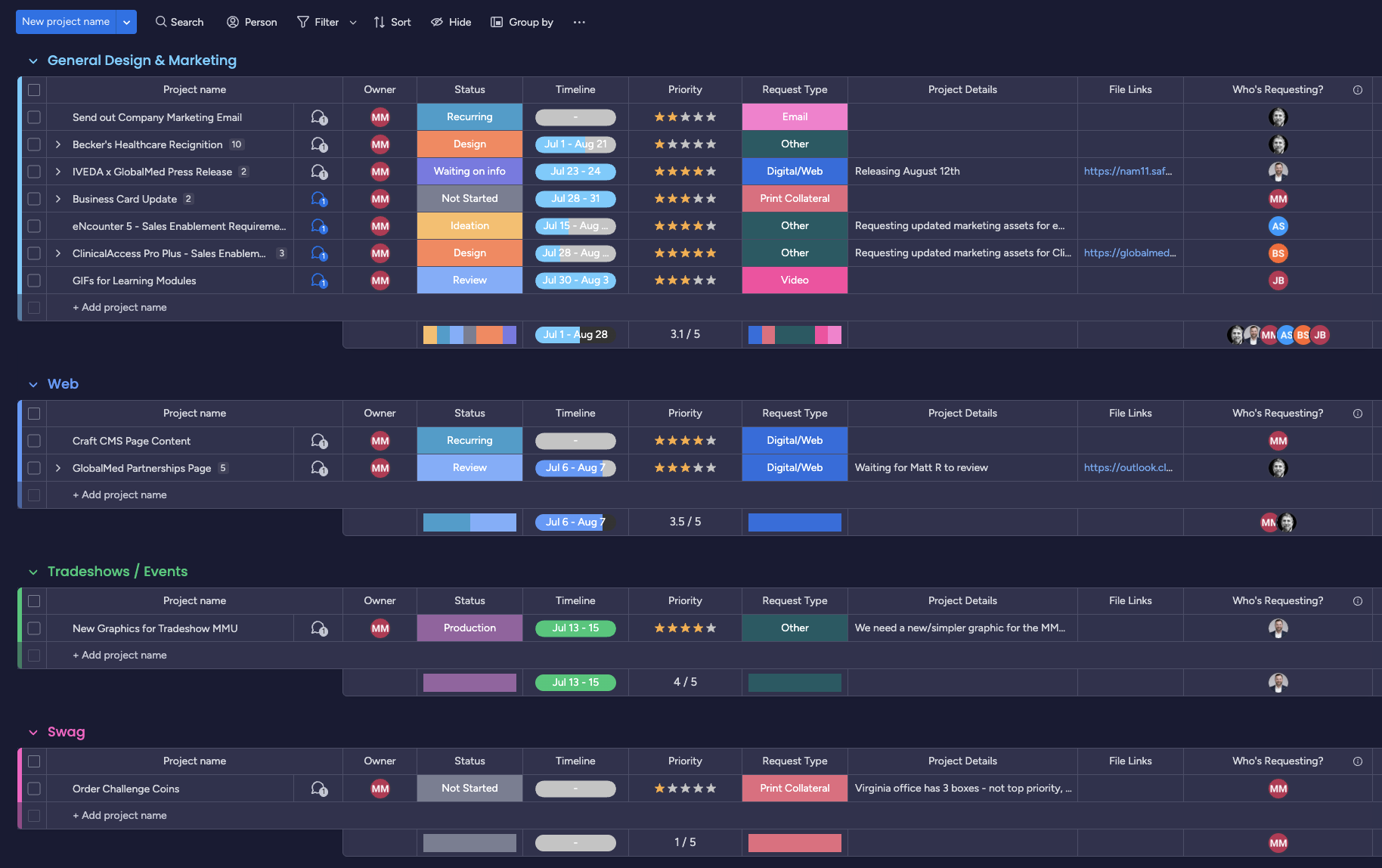
Intake was the second half. Requests used to reach me through hallway conversations, email threads, and meetings, and details got lost between them. I built a project intake board in monday.com with a submission form and fields for project name, timeline, priority, request type, project details, file links, and requester. Two automations run it: new submissions land in a waiting room group, and I get an email each time. That board is how I triage priority against deadlines and see my own bandwidth before committing to a start date.
Refinement
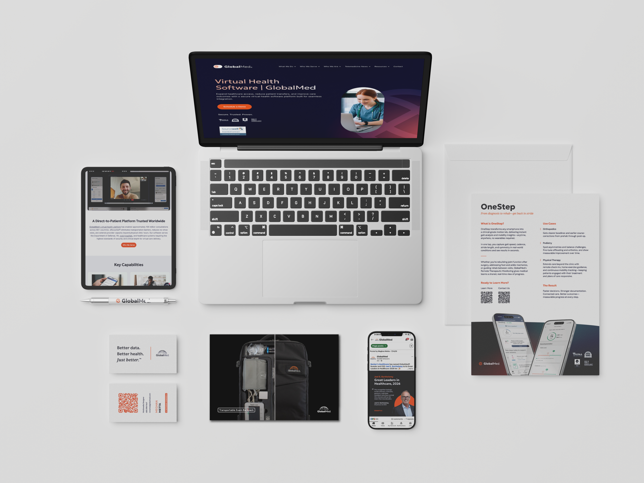
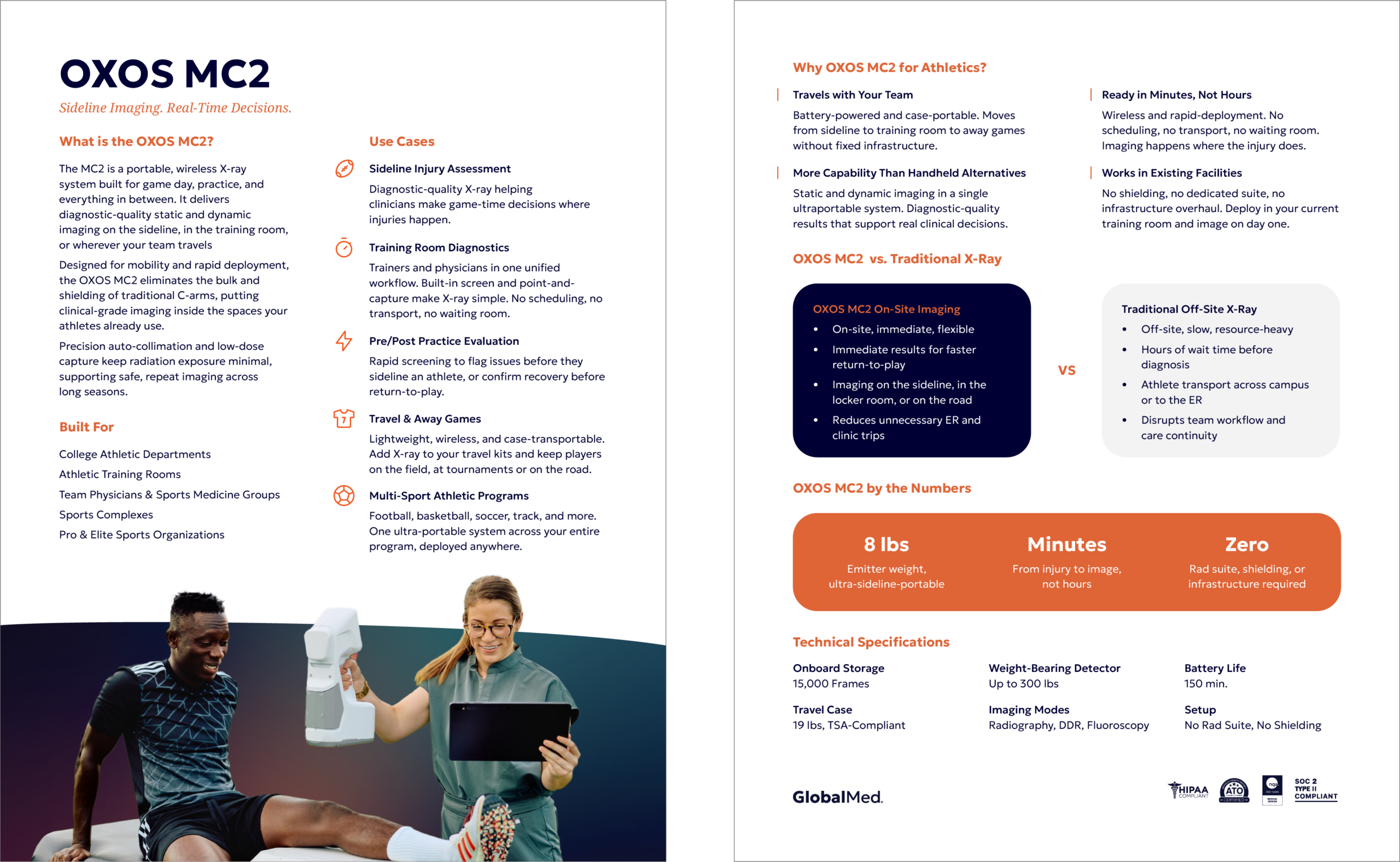
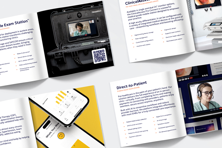
With the rules set, I built out the pieces teams reach for most: a company capabilities statement, a sales deck template with different slide styles for different information types and instructions written into the notes, standardized product sheets, HubSpot spec sheets for every product, a letterhead template, Teams backgrounds, and PC desktop backgrounds sized for the medical cart devices. I also defined an approved stock image library and the wellness logos.
Every layout leads with hierarchy and short sections. Federal readers skim, so the capabilities statement had to be something a procurement officer would finish rather than skim and set down.
Production Details
I rolled the system out by email with links to the full brand guidelines folder and separate links into each subfolder, so people could go straight to the thing they needed. Our new VP of Sales used it to find key documents without asking anyone, and people who had never submitted a design request started using the intake form.
The change I notice most is in what leaves the building. Sales now sends the current version of a product sheet instead of an old download, and I spend far less time in meetings reconstructing project details, because the request form already collects them. The same system now supports tradeshow booths, vinyl and signage, government proposals, one-pagers, video, social, and swag.
Project Details
I completed this project while working at GlobalMed Holdings LLC.
Brand Design
Meghan Metta
Creative Oversight
Brandon Stangl

© meghanmetta 2025